Development of a tourist brand for the city of Sochi
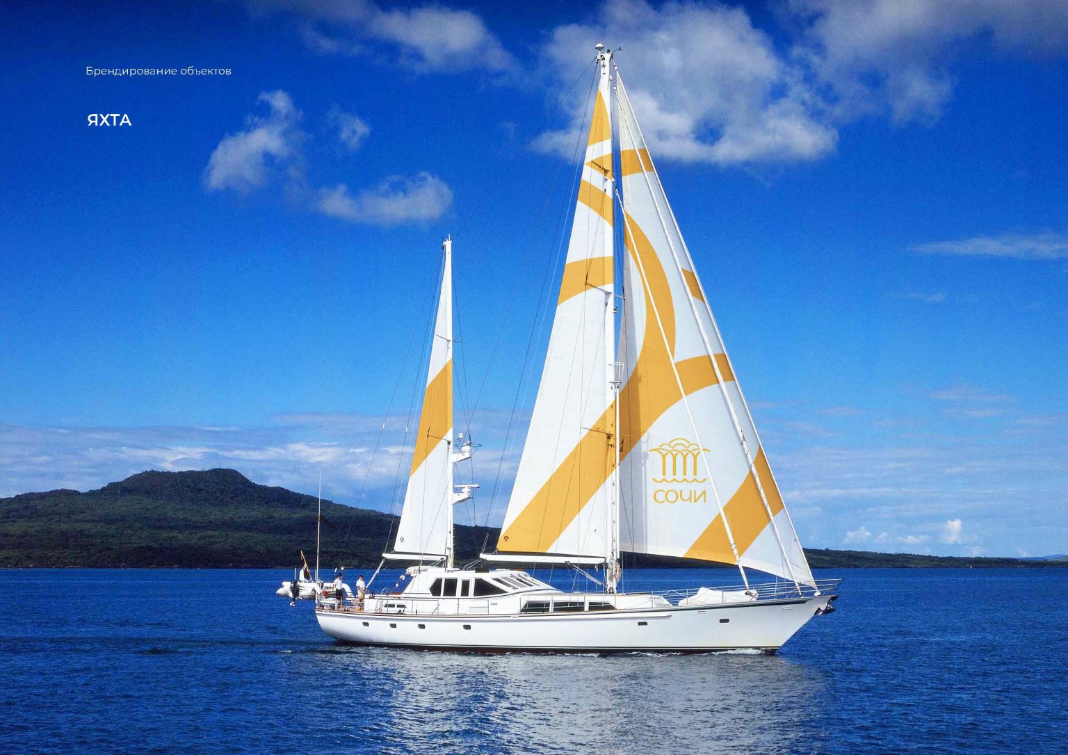
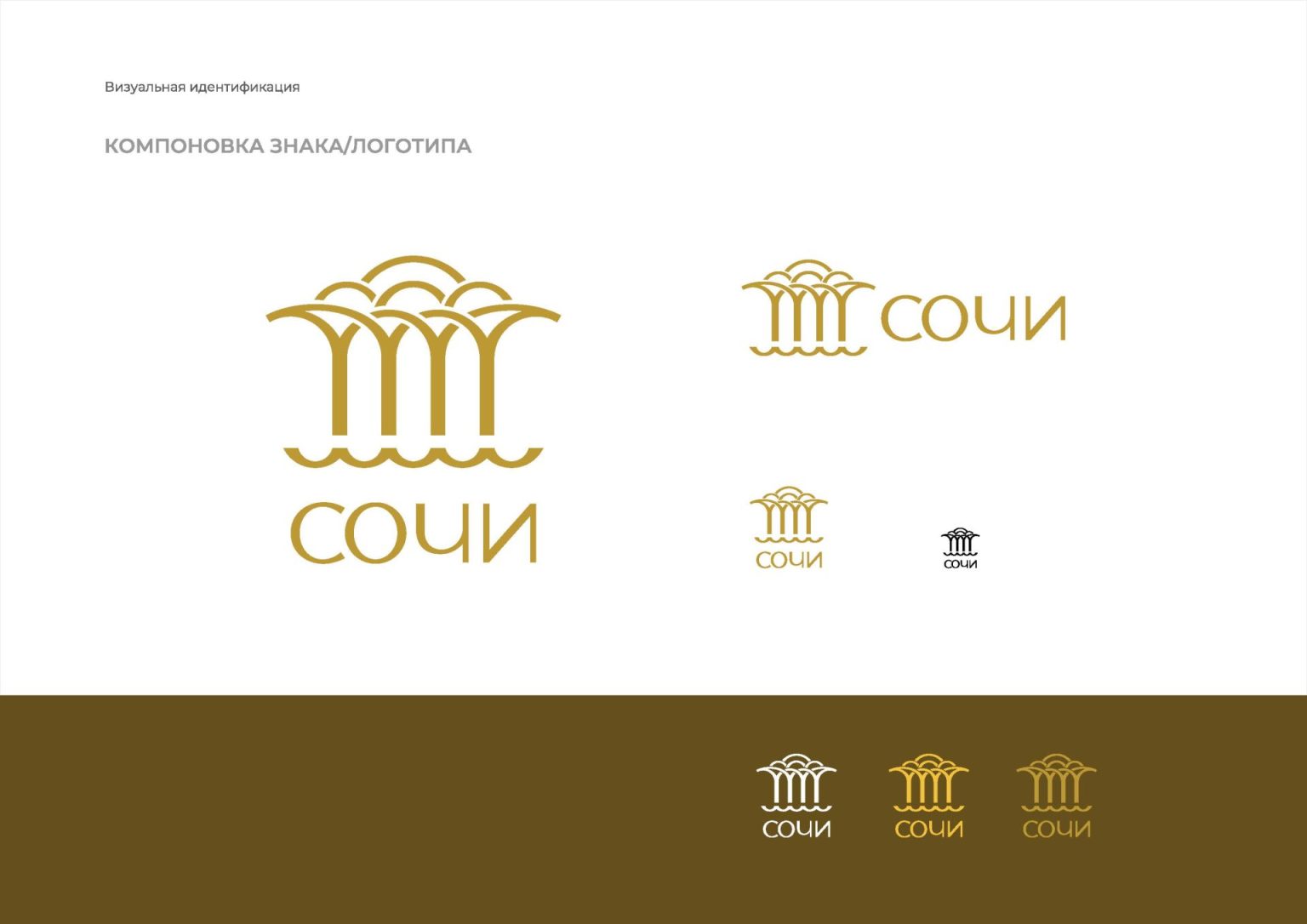
In 2020, VDS, together with representatives of the Sochi City Hall, developed a new tourist brand for the city in the form of a graphic logo. The brand was created specifically to promote the sanatorium industry in the international and Russian markets.
Задачи проекта
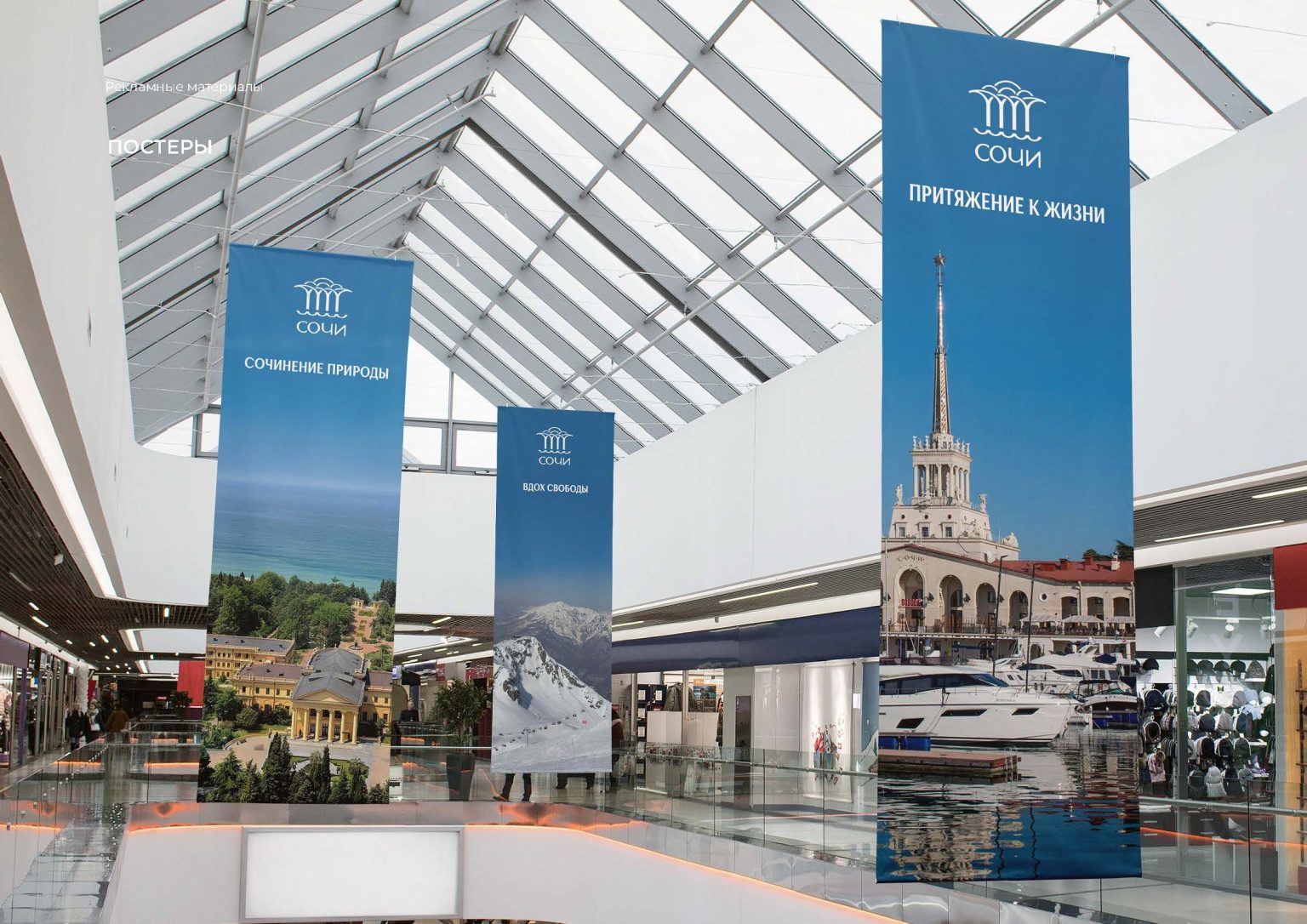
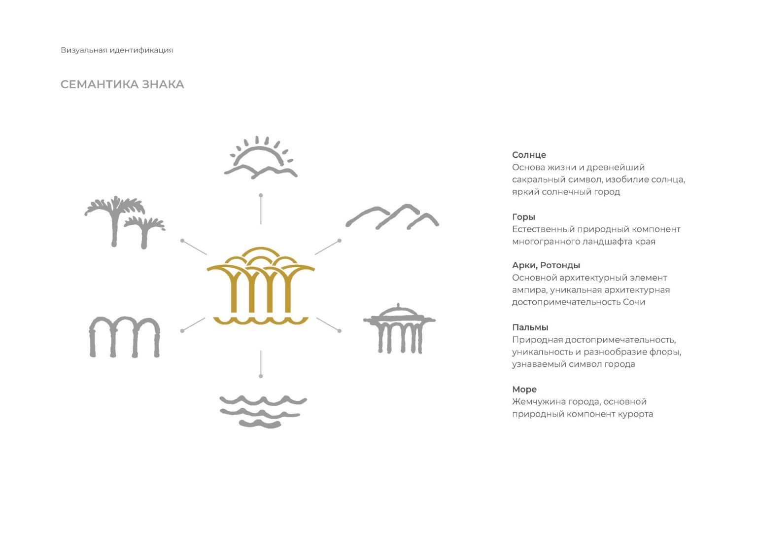
Sochi is a composition of nature, an attraction to life, a breath of freedom. This is a city whose true essence is hidden behind the "gloss". The brand is the whole philosophy of the city. His graphic visualization combined many historical and architectural meanings.
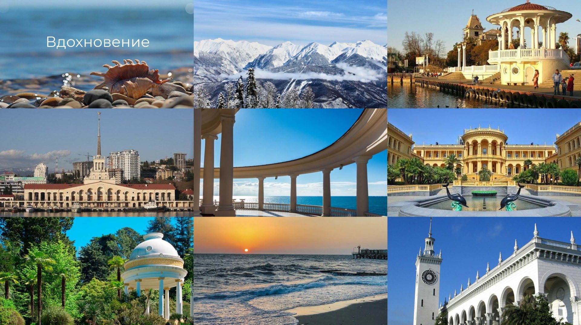
The history of the resort city of Sochi is directly related to its unique climatic and geographical features. The subtropical climate, the Black Sea coast and the Caucasus Mountains, healing springs and therapeutic mud, sea air and evergreen vegetation have determined the purpose of this amazing natural area – to give people health and peace.
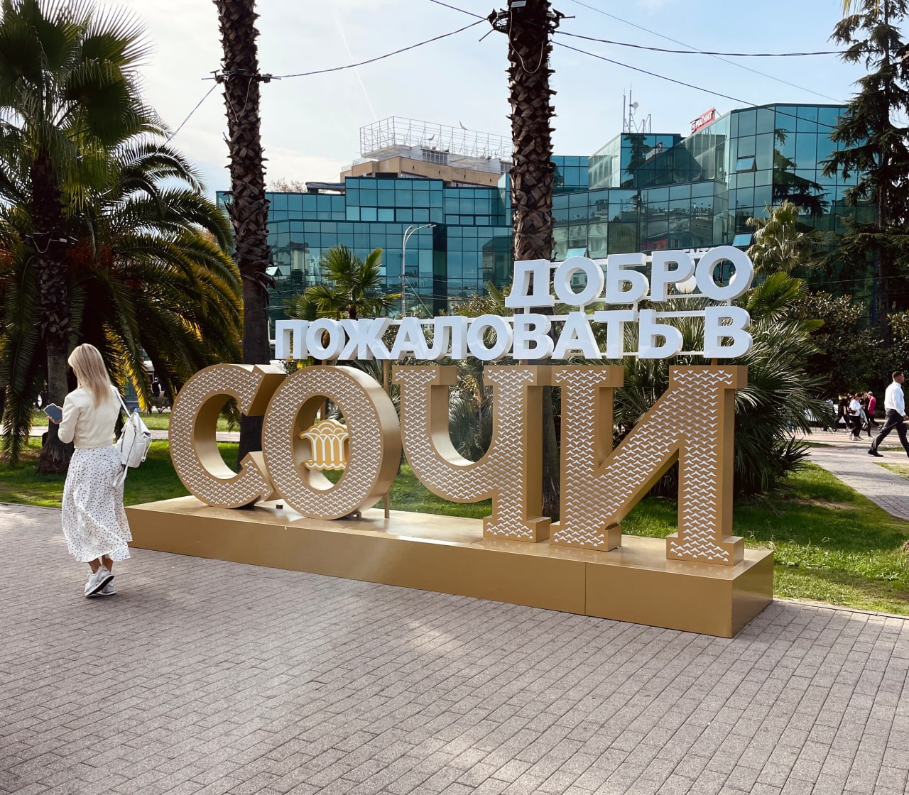
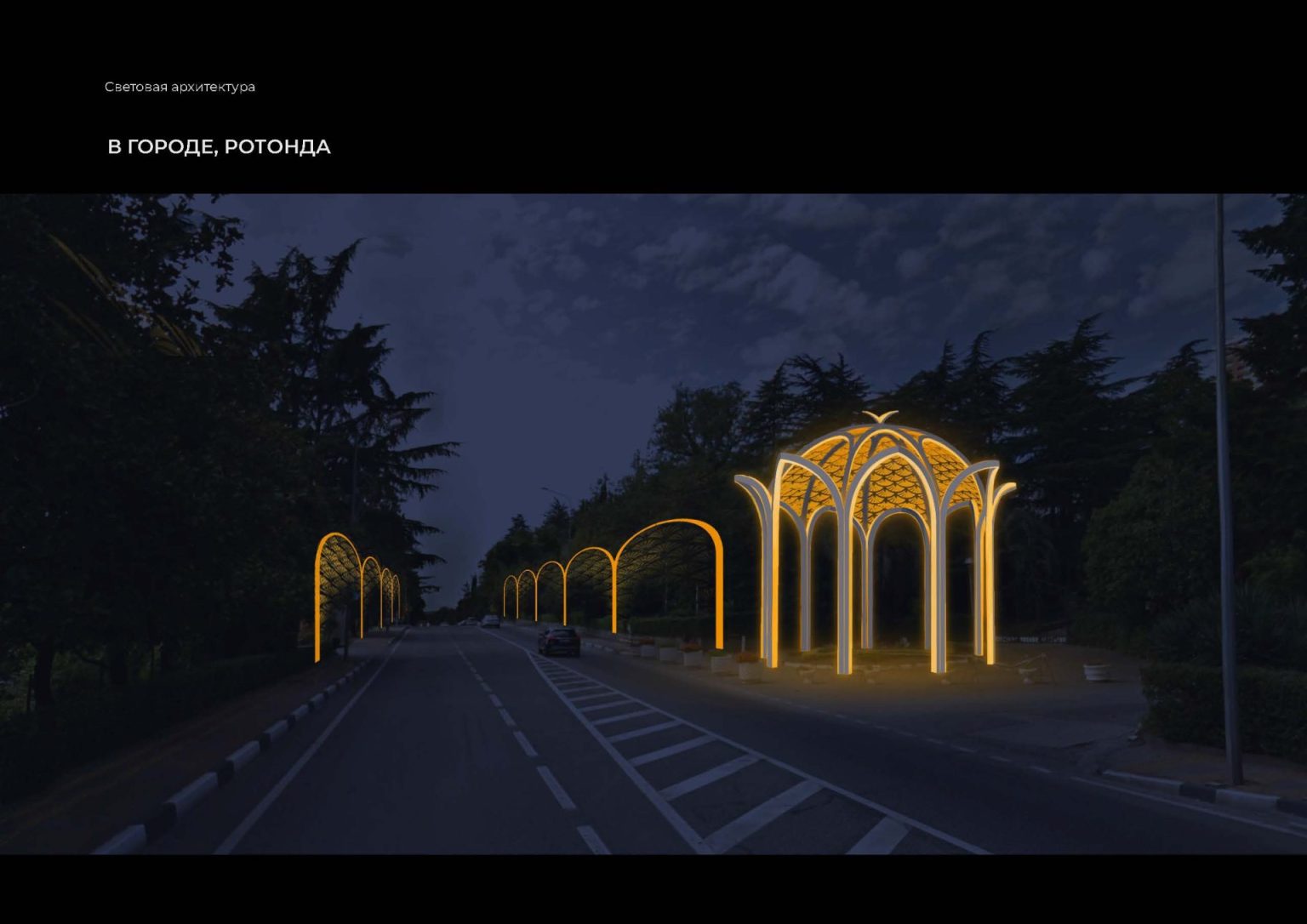
The unified style is reflected in the famous rotundas and columns, which visually connect the two main natural assets of Sochi: the sea and mountains, modern coastal and mountain clusters. The association embodies not only the traditions of health and recreation, but also the new status of the city as a year–round resort.
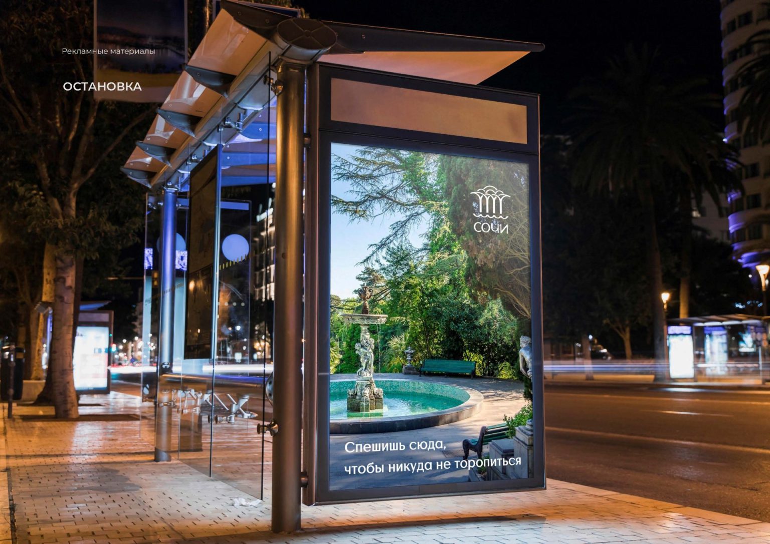
Creating the symbol of the resort, we tried to make it heraldic, but at the same time modern. It combines images that come to the mind of millions of people at the word "Sochi", images that attract people again and again!
